
Brand-On Blog
COLORING OUTSIDE OF THE (VERY PERI) LINES
Everything we thought we knew about sales and marketing has completely changed over the past twenty months, and we have seen more pivots in consumer trends and B2B go-to-market strategies over the last nine months alone than you’ve seen binge-watching season five of Friends. One thing that hasn’t changed for brand nerds like us, however, is the excitement that is the reveal of Pantone’s Color of the Year, and we couldn’t dive into the announcement of their selection for 2022 any faster if we tried.
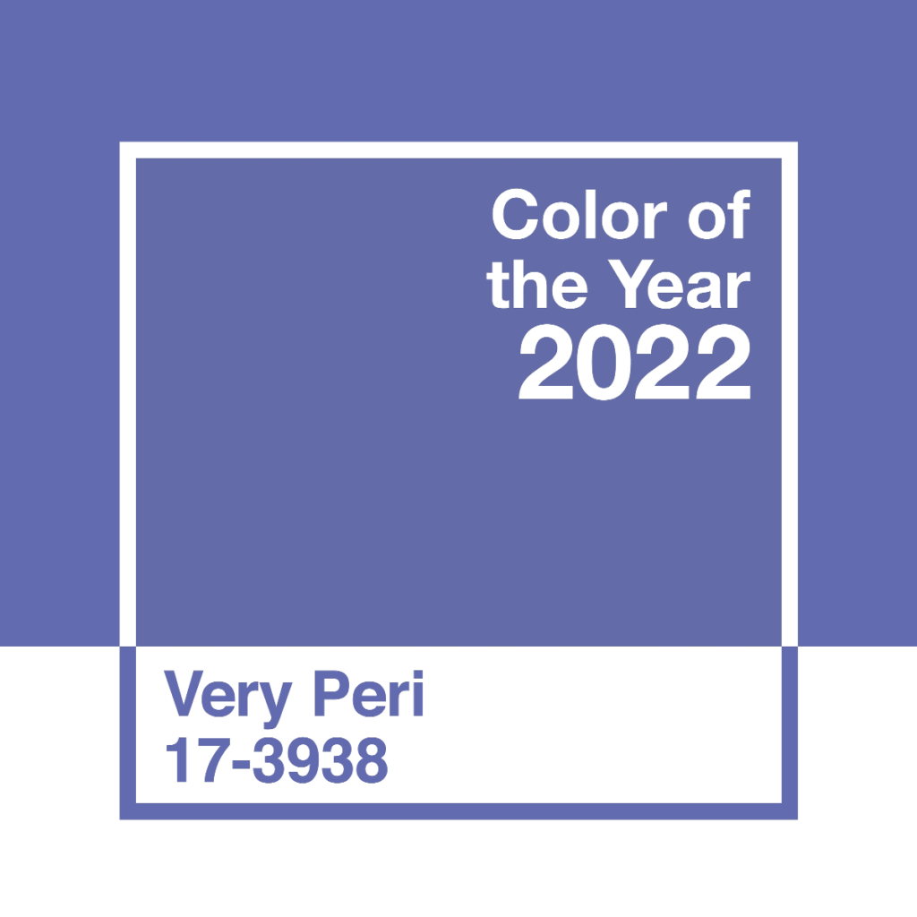
The Pantone Color Institute just announced Very Peri (Pantone 17-3938) as the 2022 Pantone Color of the Year, stating “this particular color was selected to help us to embrace this altered landscape of possibilities, opening us up to a new vision as we rewrite our lives.”
Pantone is rewriting something, alright. For the first time in the history of Pantone’s Color of the Year (twenty-three years, to be exact), this year’s color is a brand new color that was created, not selected, as the color that would be one of the greatest influences in the way we see branding by way of promotional products and decorated apparel moving forward. Creating a color “reflects the global innovation and transformation taking place in our world today,” shared Laurie Pressman, Pantone Color Institute’s VP, in the recent announcement. “As society continues to recognize color as a critical form of communication, the complexity of this new red violet with infused blue hues represents the expansive possibilities that lay before us.”
Intrigued?! Us too.
If you’ve been hanging with us for a while, you probably read our take on Pantone’s 2021 Color(s) of the Year, but we wanted to dive in a little bit deeper and take you back as we get ready to help you and your business plan new marketing strategies for 2022. These people at Pantone really do seem to know what they’re talking about when it comes to branding, after all.
2021 brought another “first time ever” when Pantone selected not one, but two colors to set the tone for trend forecasters, product developers, fashionistas and retail merchandisers across the globe for the upcoming year, and while the decision was fairly unpopular across various demographics, it was a decision intentionally designed to create new avenues for marketers and advertisers alike. The addition of a second color was intended to tell a story that represented a union; a ‘better together’ mentality that created space for new collaborations to help take brands to new, innovative heights. And hey, after nine months of living in a global pandemic with so much uncertainty still around every corner we turned, the color story of Ultimate Gray (Pantone 17-5104) and Illuminating (Pantone 13-0647) was a color-story we could immediately get behind.
Ultimate Grey painted a durable and stable picture in our minds; it was a neutral color that would help give our creativity it’s unbiased perspective and open-mindedness back. Illuminating was a happy little shade of yellow that was both light and calming, yet bright and exciting all at the same time, and Pantone stated it was specifically chosen at that time to demonstrate “the promise of something sunny and friendly.”
It worked. Consumers everywhere were craving simplicity, and major brands worldwide were suddenly rebranding to a more simple, modern logo. ABC was one of many major brands that opted to rebrand, and they did so to a simple, single-color version of their already-existing dimensional logo, with a slight font update. Automotive companies such as GM and Volvo have also stripped down their logos to a flat, single-color logo with a slight digital feel, and shades of gray have quickly become the new go-to accent color for the simplistic black-and-white-everything print marketing we see more and more of every day.
Over the course of the past year, brands everywhere have started using more subtle, calming colors to tell their story and share their vision as opposed to the abstract neon’s we started seeing when the 80’s really started making its comeback pre-pandemic. The Pantone Color of the Year is one of the single most important key factors in forecasting whether upcoming trends will continue to build off of the previous year, or if they’ll call for new shifts and adaptations all together. This year, Pantone is definitely taking their color-story to an entirely new level, and we are so here for it.
Well played, Pantone. Well played.
For more information on all of the additional behind-the-scenes services Brand-On offers, such as custom patches on the coolest headwear, kitting and custom packaging for your virtual events, online stores, fulfillment and so much more, go to brand-on.us/our-work/.
You can also contact us for more ideas on how we can help you amplify your image by visiting us at brand-on.us/contact-us/, where you can subscribe to our newsletter to get the latest on sales, product releases, industry news, and more. Don’t forget to follow us on Instagram using the handle @brand_on.life – all the cool kids are doing it.


