
Brand-On Blog
News & Events
NOTHING BUT BLUE SKIES (AND BLUE PROMO) AHEAD
If you’ve been following our Speaking Promo education series (which duh, of course you have), then you’re familiar with the Pantone Matching System (PMS colors), and how they apply to everything we do here at Brand-On. What you might not know, however, is for the past 21 years, the Pantone Color Institute announces a Color of the Year, which is designed to set the tone for marketing, branding, and fashion influencers everywhere.
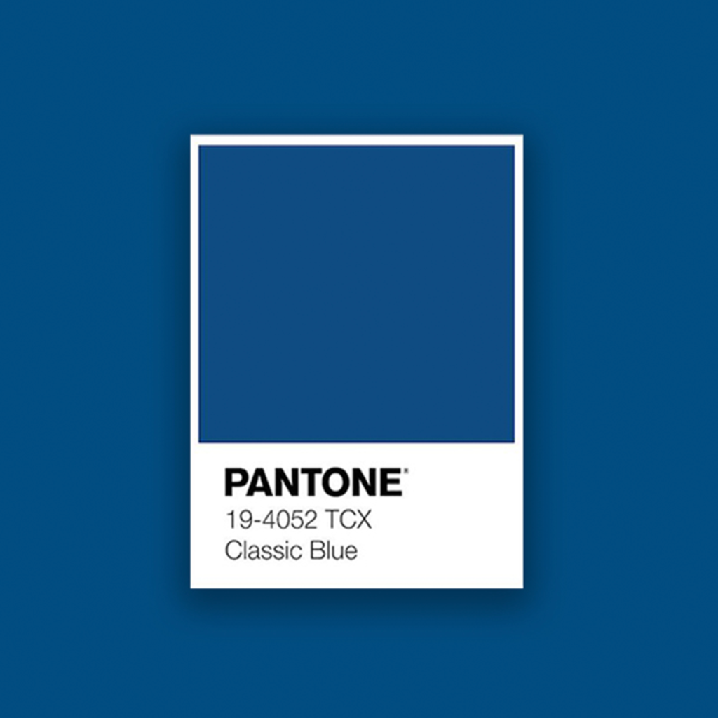
Out of 1,864 colors in the matching system, Pantone recently announced the color for 2020 will be… wait for it… Classic Blue. Yep, you read that right. The color chosen to essentially be what is guiding a year of all areas of design across the globe, including apparel materials and trends, product textures, company rebranding inspiration and social media platforms, is quite simply, blue (well, PMS number 19-4052, to be exact). If you didn’t know the Color of the Year was a thing, it might be hard to understand why next year’s choice caused quite an uproar, specifically in our industry.
The chosen color has historically been anything but basic, and the color names assigned to each have been anything less than interesting. To give you an idea of what we mean, let’s take a little trip down Pantone Lane, shall we? The last three years included Greenery in 2017, Ultra Violet in 2018, and Living Coral was the hot choice for 2019. Those are pretty easy to assume what the colors look like, however Marsala was chosen for 2015 (we can’t put our fingers on how to describe what that color actually is either), and they went big in 2016 when they named not one, but TWO colors; Rose Quartz (a light shade of pink) and Serenity (a light shade of blue). 2012’s Tangerine Tango looked more like fire engine red than what most would envision a color named after an orange to be, and Pantone got a lot of bad press when it appeared to be a repeat of 2004’s Tigerlily, only with a different odd name to describe it.
There is a surprising amount of research and data analytics that go into Pantone’s decision each year, and that decision is influenced by everything from technologies, popular travel destinations, sporting teams and events, and even political campaigns. Knowing that there is actually a method to the madness, it’s actually not too shocking that this is the choice for 2020. Classic Blue is a color shade recognized as an anchoring color; one that represents reassurance, confidence and stability. Pantone expressed they wanted this color to do just that, recognizing the instability and uncertainty gripping the world as we embark on a new decade. Ironically, Classic Blue resembles the reasoning for the very first Color of the Year, Cerulean Blue, exactly two decades ago. The Y2K scare in 1999 went from a potential worldwide technological crisis to talks of the world ending and everything in between. Cerulean is a shade of the blue family often used as a symbol of capturing a moment in time, which for many, that time included complete chaos and a series of panic attacks with people everywhere. If only they had chosen a more reassuring and stable shade of blue then, as they’ve done now.
You didn’t think reading a blog about a simple color could be so deep, did you? Yeah… us either.
For more ideas on how we can help you amplify your image, go to brand-on.us/contact-us/ where you can also subscribe to our newsletter to get the latest on sales, product releases, industry news and more. Don’t forget to follow us on instagram using the handle @brand_on.life – all the cool kids are doing it.


